

SnackWorks | A Snacking Empire Online
SNACKWORKS | BUILDING A SNACKING EMPIRE ONLINE
SnackWorks, a sub-brand of Mondelez, serves as a digital hub for all things snack-related, including recipes, nutrition facts, and brand information. Mondelez tasked us with creating a new digital presence for SnackWorks, and this case study explores the comprehensive rebranding and digital overhaul we undertook to transform SnackWorks into a vibrant, engaging platform.
STRATEGY AND APPROACH
A Multi-faceted Strategy For A Multi-taste Audience, Centered On Rethinking How People Consume Snacking Content Online
We recognized that users often find snacking inspiration on social media rather than traditional websites. Hence, our approach involved creating a seamless content flow from social media to the SnackWorks website. This included a robust design system that allowed the client to easily build pages and content while maintaining evergreen relevance.


Snack by Snack:
Building a Brand
Current
Visual Identity
Using the core elements and brand elements of the past Snackworks logo as the base of the designs while leveraging content from channels like social.

Future
Brand Identity
Our goal is to take the elements from the current brand system and Vis ID, mixed with a bit from the work MediaMonks completed and develop a new style that feels fresh, dynamic and contemporary.

VISUAL IDENTITY
Snack-Sized Beginnings to Full-Flavored Brand. Key Design Details Used To Explore Within Digital Concepts.
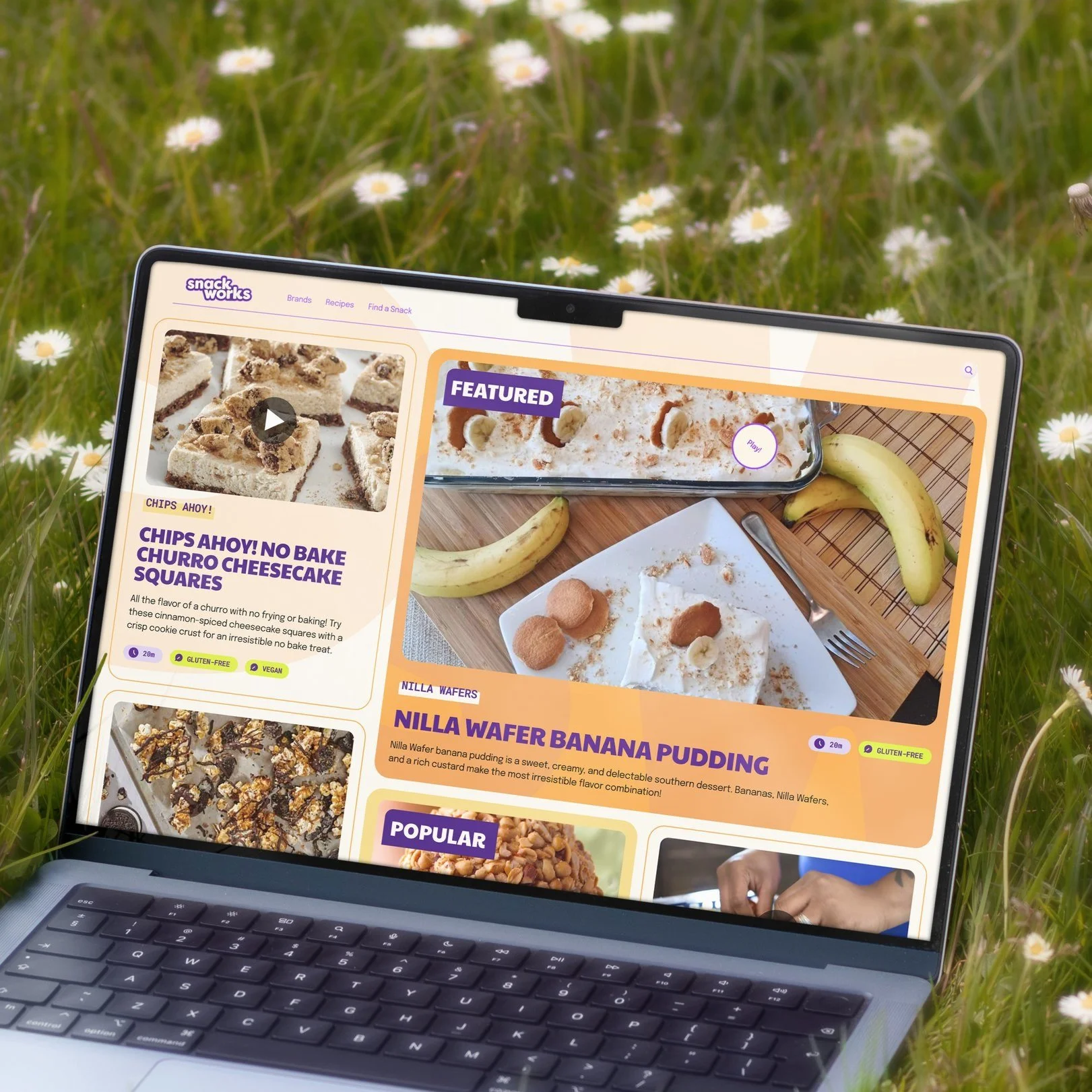
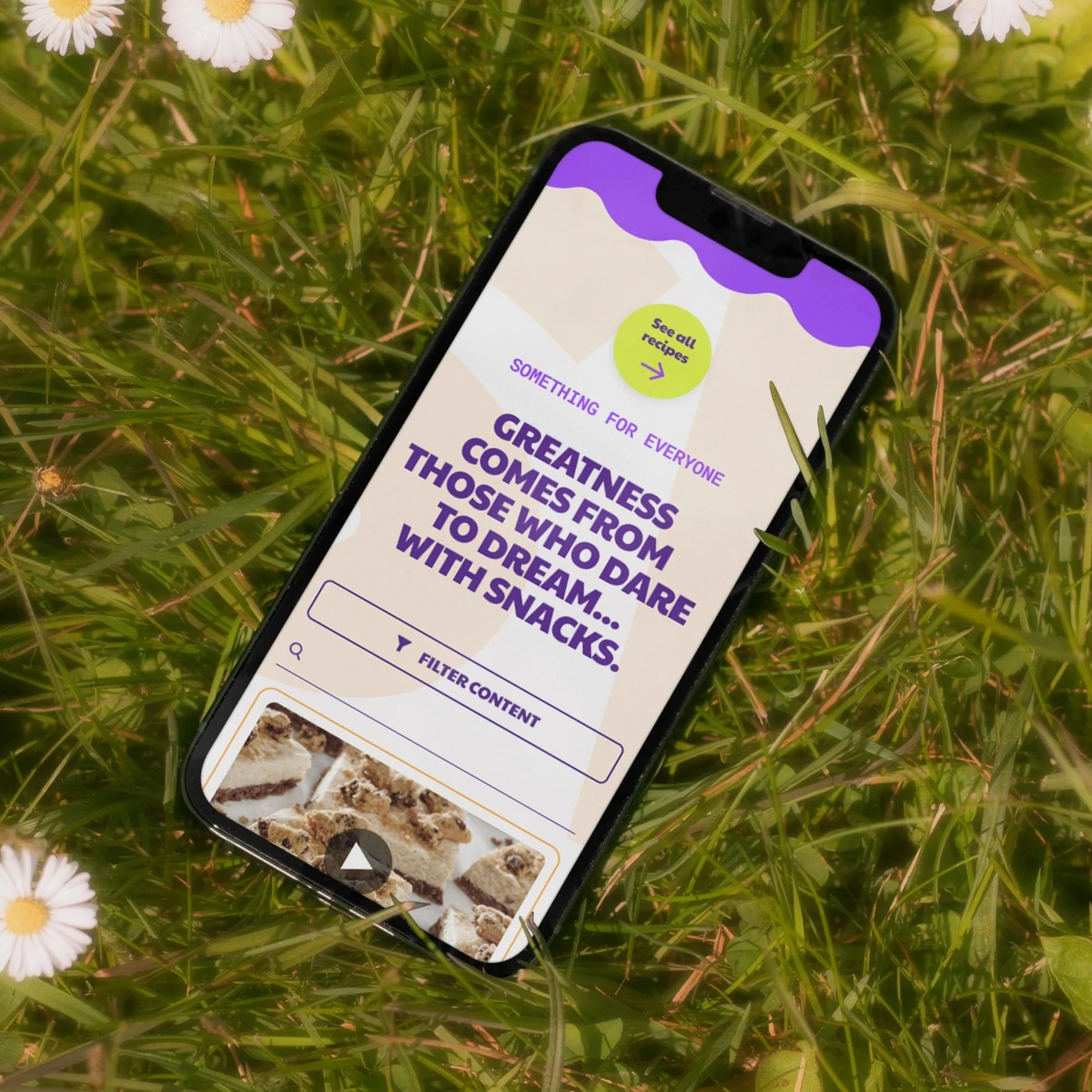
The new visual identity for SnackWorks is colorful and fun, incorporating primary SnackWorks colors and supporting secondary colors to create a cheerful environment. This visual identity is consistent across the website and social media, ensuring a seamless user experience. The design elements are modern and user-friendly, making the content accessible and engaging.
BRAND MARKS


PHOTOGRAPHY

COLORS


TONE OF VOICE
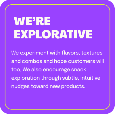
Fun, Snarky, and Engaging — We developed a tone of voice for SnackWorks that is lighthearted, explorative, and self-aware.
Websites get in the way of snacking. Plus, people say nobody reads anymore. Boo. So how do we get people to listen to what we have to say? It comes down to how we use our SnackWorks voice.
The voice is playful and humorous, designed to entertain while providing valuable information. This tone is consistent across all digital touchpoints, creating a cohesive brand personality that resonates with a younger, socially active audience.


Modular
Design System
Flexible and Scalable
We implemented a modular design system that allows for easy updating, maintenance, and customization. This system breaks down the site into small, independent parts that can be developed and tested separately before being combined into a larger system. This approach ensures flexibility, scalability, and maintainability, making it easier for the client to manage the site efficiently.

Ecosystem Framework
At a high level, Snackworks is divided into two key areas. The central SnackWorks experience that owns key functionality and connects to the sub-Snack-brands across the portfolio, like Oreo. Sub-brand Platform pages can fall into one of three different priorities, which changes the focus of the page based on what makes sense for the individual brand.

Product & Commerce — Product led experience, that is commerce ready. The foundation being a large volume of products or lack of other key functionality,

Recipe depth & Breadth — Content led experience with a focus on recipes. Indicative of a brand focus on recipes or number of key traffic drivers.

Social & Editorial Content — Content led experience that focuses on community via social integrations and longform content designed to inform and engage.


RESULTS
The new SnackWorks site saw a significant increase in organic growth and user engagement.

The fun and snarky tone, combined with the colorful visual identity and flexible design system, created a digital hub that users love to explore. The seamless integration of social media content drove traffic to the site, while the modular design made it easy for the client to keep the content fresh and relevant.
The SnackWorks project showcases our ability to lead a full rebrand, build a cohesive brand identity, and develop a large, flexible design system and website. This case study is a testament to our expertise in creating engaging, dynamic digital experiences that resonate with modern audiences and drive brand success.
This case study reflects a comprehensive rebranding and digital transformation project for SnackWorks by Mondelez, highlighting the strategy, execution, and results of the project. It is designed to showcase the ability to lead and execute large-scale digital branding and web development projects.
