BELA Brand Seafood | Rebrand
BELA Brand Seafood | Rebrand
BELA Seafoods has rich history deeply rooted in both Portuguese fishing traditions and New England’s maritime legacy. Family- and veteran-owned, the company had a strong foundation, yet its branding felt outdated and disconnected from today’s market. The leadership at BELA wanted to reposition the brand to not only honor its storied past but also capture the attention of modern consumers, particularly those who care about sustainability, quality, and authenticity.
The challenge was clear: create a brand identity that communicated BELA’s deep roots, high-quality products, and sustainable practices, all while resonating with a new generation of seafood lovers.
BRANDING APPROACH
We wanted to ensure the branding told BELA’s story in a way that felt modern, memorable, and deeply connected to its origins.
Our approach to BELA’s rebrand centered around aligning their rich heritage with contemporary design elements that would make the brand stand out on retail shelves and online.
Visual Identity:
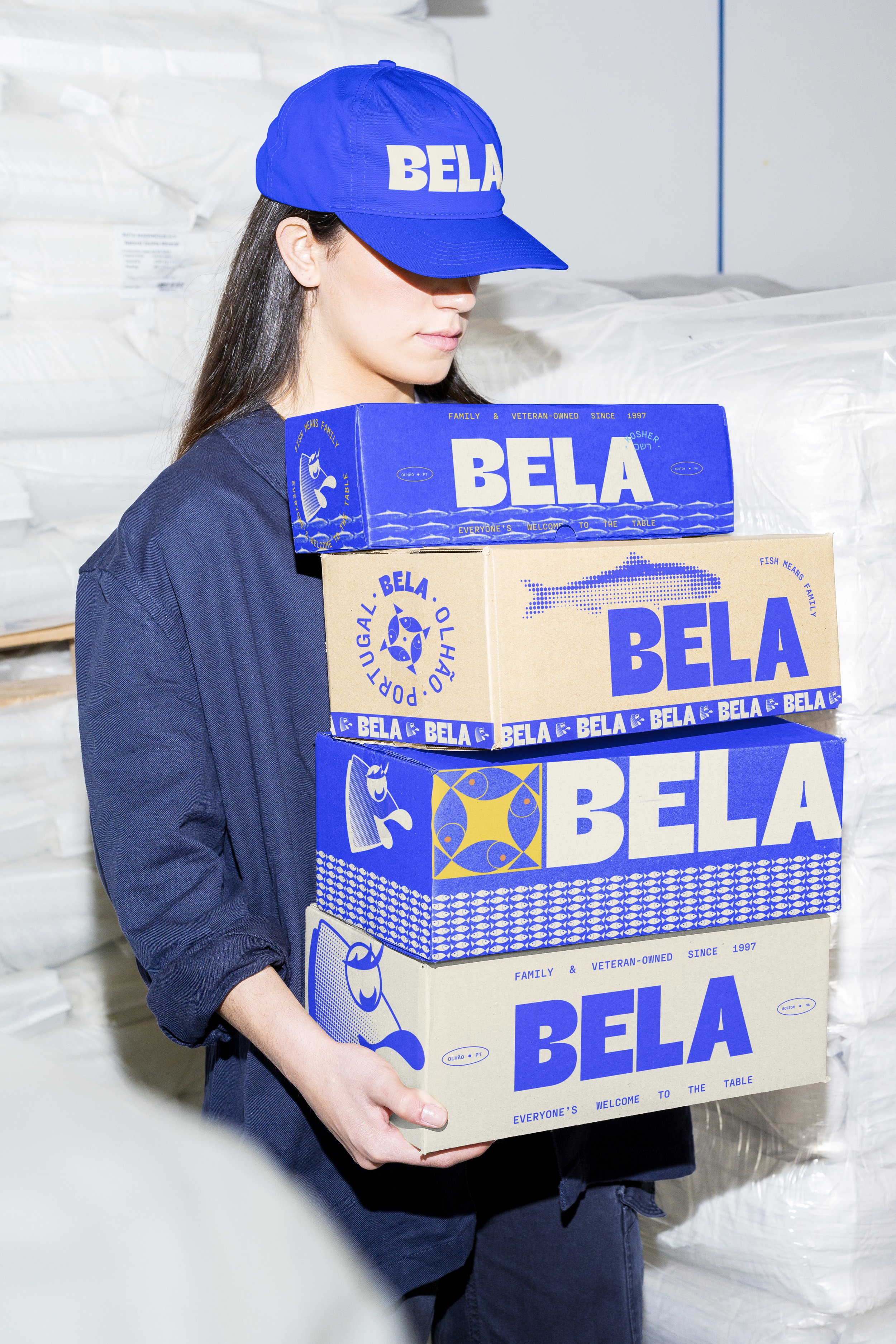
We developed a logo that encapsulated the balance between tradition and modernity, incorporating subtle nods to Portugal’s maritime history through iconography and typography that evoked both a timeless and premium feel. The design uses clean, sharp lines with a nod to nautical symbols, giving BELA an updated yet authentic look.
Brand Elements:
The branding is inspired by the natural hues of the Atlantic Ocean and the Portuguese coastline. Deep blues, and warm, earthy tones reflect the brand’s coastal origins while exuding a sense of sustainability and environmental consciousness. The typography was chosen for its editorial, high-end feel, helping to elevate the brand into a more premium space.
BELA’s Voice:
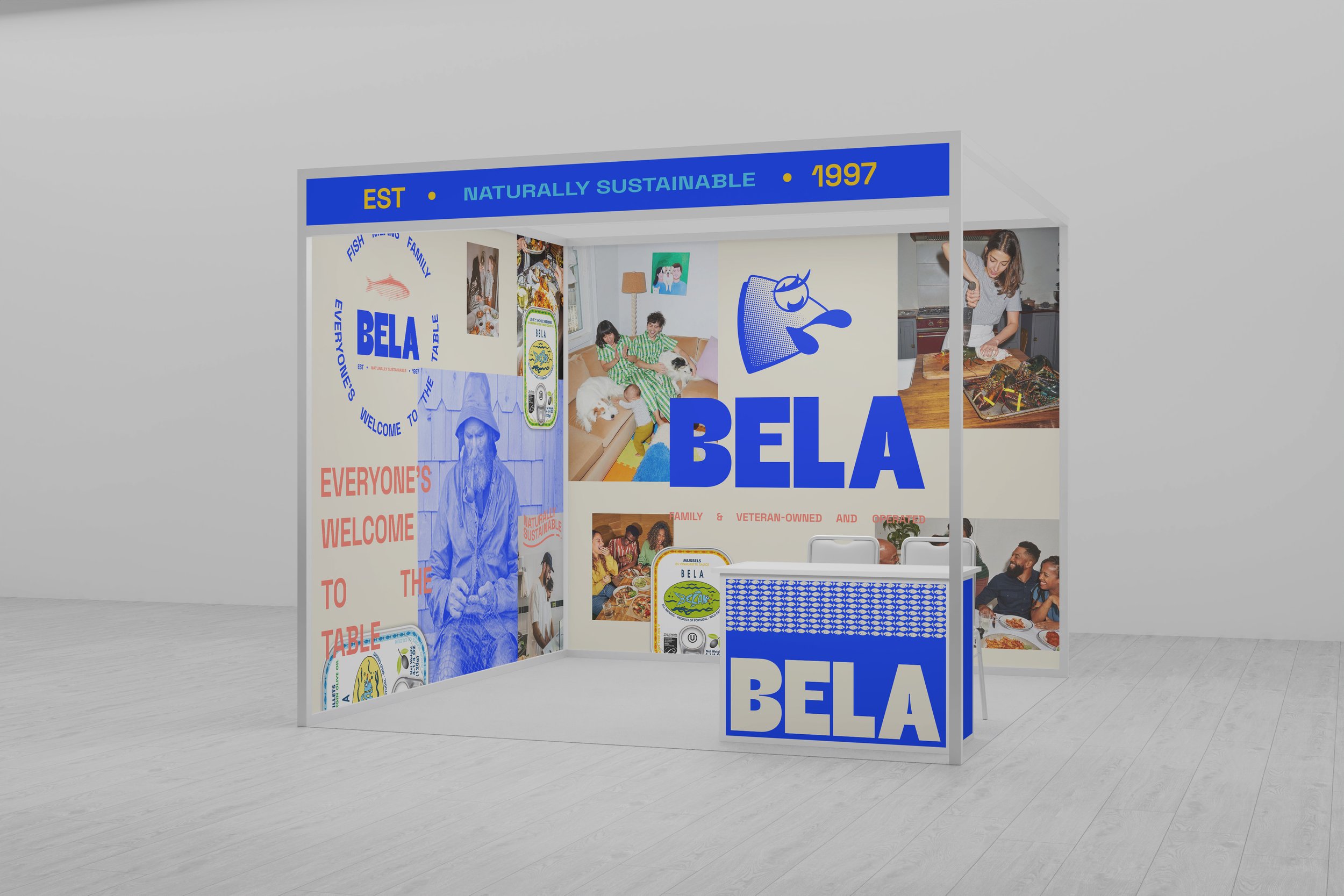
The tone was crafted with integrity, honor, & togetherness, core values that BELA emphasized as a family-owned business. We developed messaging that emphasized not only the quality of the products but the shared experience of enjoying seafood with loved ones. The voice strikes a balance between a down-to-earth, while positions BELA as a leader in the sustainable seafood market.

Branding
Approach
Crafting a Visual Identity That Celebrates Tradition and Innovation
The approach was to create a brand that felt both authentic to BELA’s roots and approachable for a modern market. We focused on developing a brand that evokes the joy of family, community, and shared meals, while maintaining a gritty, hard-working aesthetic that honors BELA’s Portuguese heritage and New England legacy.
Building a Brand That Is Both Visually Bold and Deeply Rooted in History
VISUAL IDENTITY
Wordmark
The BELA wordmark combines modern design with historic touches, using ink traps and organic spacing to evoke authenticity and craftsmanship. Curved letterforms add intrigue and reflect BELA’s rich history.
Mascot Evolution
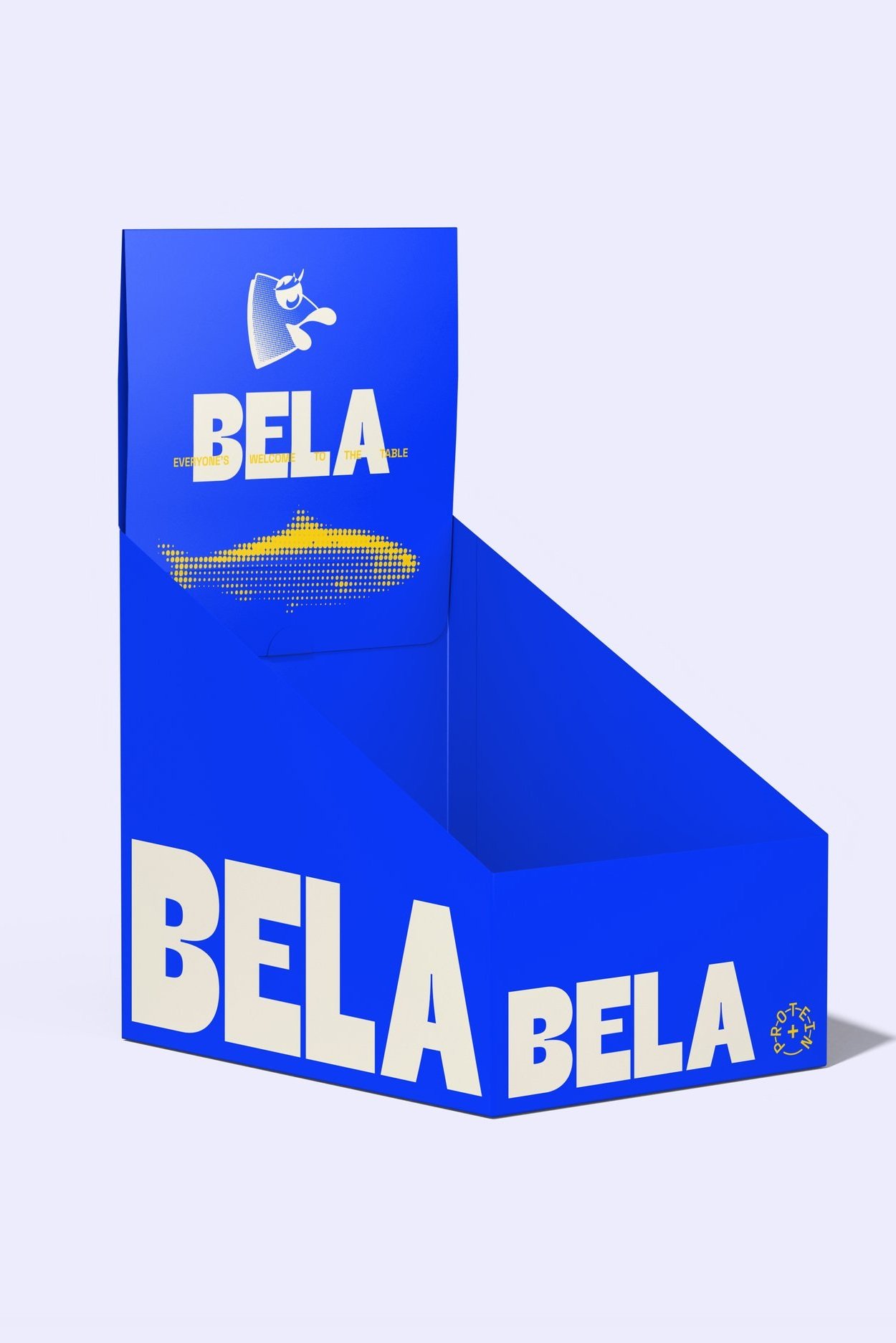
BELA’s sardine mascot was modernized with bold lines and halftone patterns, blending tradition with a forward-looking design.
Patterns & Visual Elements
We introduced legacy-inspired patterns, like a sardine halftone and school of fish motif, to bring movement, texture, and depth, reflecting BELA’s layered history in a dynamic, familiar way.


